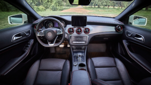
One of my pet peeves is driving a rental car with a poorly designed dashboard. Nothing is where I expect it to be. The buttons are scattered in random places, the icons are difficult to read or understand, I can’t figure out whether I am changing the volume or adjusting the car temperature. Instead of feeling in control, I feel distracted and frustrated. When a dashboard is poorly designed, the entire driving experience feels off. On the flipside, driving in a car with a well-thought-out dashboard improves the driving experience dramatically.
A car’s dashboard is more than just a collection of screens, buttons, and knobs – it’s the core of your driving experience. The best dashboards disappear into the background and allow you to focus on the road. The worst ones make you work harder than necessary and can be frustrating to make simple adjustment to.
So how do you evaluate a car dashboard? Whether you’re buying a new vehicle, renting one, or you are curious about automotive design, here’s a deep dive into what makes a dashboard functional, intuitive, and an enjoyable experience.
The layout: First impressions matter
When you first step into a car, the dashboard sets the tone for your entire experience. Like all good user interfaces, the best designs immediately make sense, even if you’re driving the model for the first time.
Think of the controls you use most frequently. This includes climate, the stereo, headlights, and hazards. You’ll need to know how to adjust all those buttons and they should be easily within reach, logically grouped, and not scattered across various sections of the console.
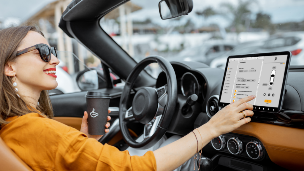
German automakers like BMW and Audi design dashboards with a driver-centric focus, angling the buttons slightly toward the driver to improve access. On the other hand, Tesla took a minimalistic approach. They removed nearly all physical buttons and consolidated all the controls into a single touchscreen. There has been much debate amongst drivers who find it distracting to use a screen for basic functions like adjusting the air conditioning.
The key takeaway is that a dashboard should feel natural and intuitive, not like a puzzle you need to solve for driving.
Striking the right balance between screens and physical controls
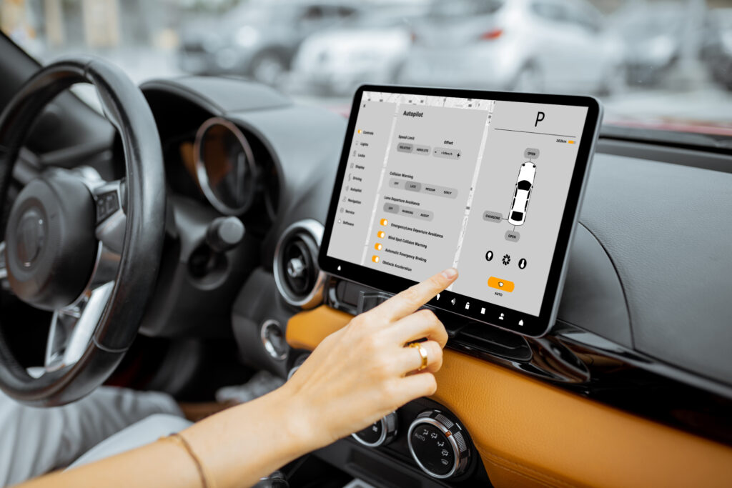
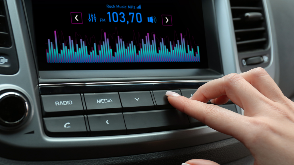
Touchscreens have become the dominant trend in modern car interiors, but not everyone agrees that’s a good thing. While a large, high-resolution display can make a car feel futuristic, it also introduces new challenges—especially when replacing traditional controls.
A study by Sweden’s Vi Bilägare magazine found that physical buttons are significantly safer than touchscreens. In tests involving real drivers, simple tasks like adjusting the radio took nearly twice as long when using a touchscreen compared to physical controls. This delay increases the time a driver’s eyes are off the road, increasing the risk of accidents.
Manufacturers like Mazda and Honda still prioritize physical buttons for core functions like volume control and climate adjustment. On the other hand, companies like Tesla and Rivian have committed to a fully digital interface.
From an evaluation standpoint, the best dashboards find a balance: a responsive touchscreen for complex functions like navigation and smartphone integration, but also tactile controls for frequently used settings. If a car forces you to navigate multiple menus just to adjust the fan speed, that’s a red flag.
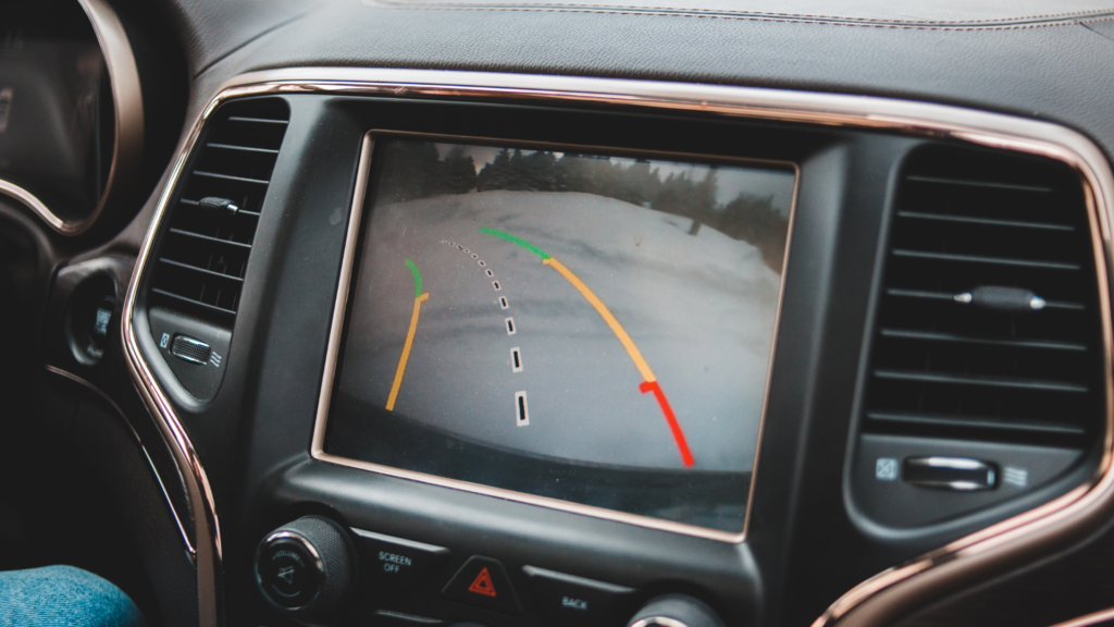
Screen placement and visibility
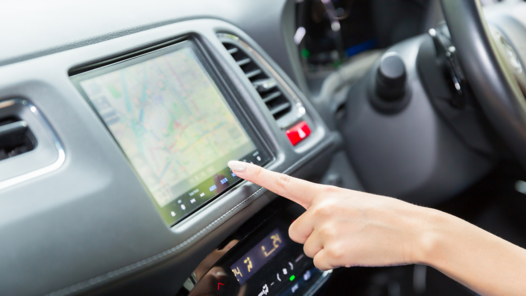
A well-designed screen is more than an enhancement – it’s a safety feature. You should be able to glance at your screen quickly without taking your eyes off the road.
Placement for screens matters. Some manufacturers place infotainment screens too low, which forces drivers to look down to see the navigation. Ideally, others place screens at eye level, which is easier to reference. The ideal placement is somewhere in between where it is in the driver’s line of sight but does not obstruct the windshield.
A well-designed dashboard should have an anti-glare coating and high contrast so that text and icons are always clear and easy to read. Lighting and technology go hand in hand. If a dashboard is poorly designed, it may become invisible in bright sunlight. Or if it is a reflective surface, it can create a glare. Make sure you can control the contrast on the dashboard screen, whether it is daytime or night.
Instrument clusters: digital vs. analog
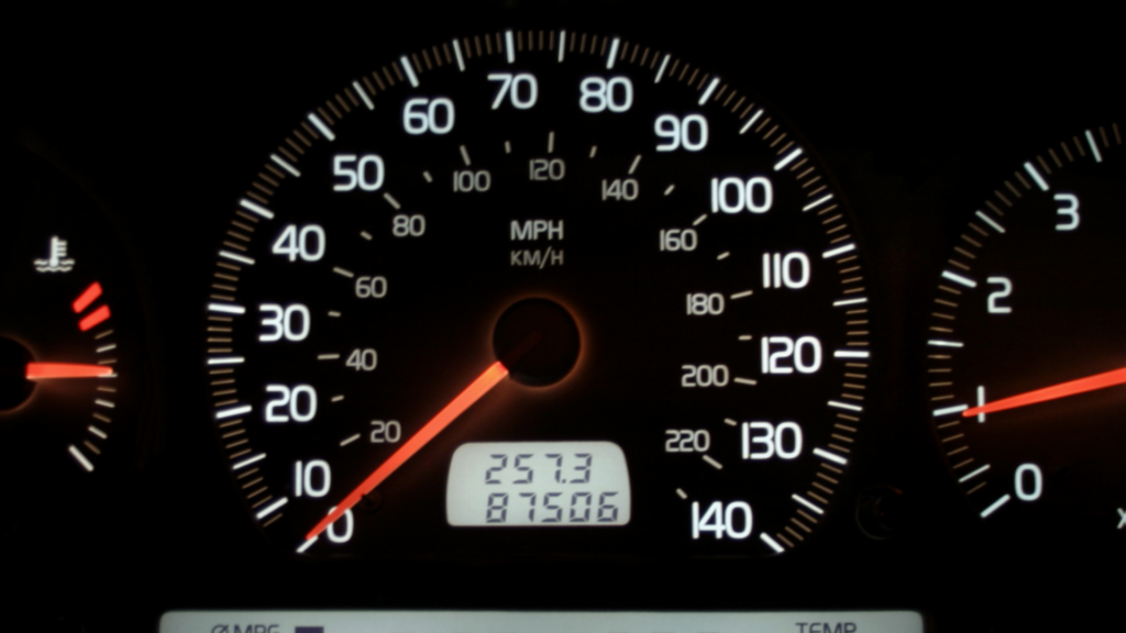
An instrument cluster is a panel in the dashboard of a car that displays the temperature, speed, fuel-level, engine temperature, and warning lights. For decades, manufacturers created these as analog dials. However, as digital technology improved, manufacturers replaced traditional gauges with fully digital instrument clusters.
Modern displays allow you to customize different layouts to prioritize certain information. For example, some cars allow you to switch between the speedometer view and a full-screen navigation display. Others, such as Mercedes Benz, give you the option to transform the entire look and feel of the instrument panel, allowing you to switch between minimalistic layouts and high-end graphics.
Personally, I believe the simpler the better. We want to reduce the cognitive load, which is the amount of time our brains take to process information, by presenting options as obvious and clearly as possible. Just because an instrument cluster is modern does not make it better. Often digital layouts overly complicate the experience and present too much information in a confusing way. It’s best to keep the essentials which includes the speed, fuel level, and engine temperature, clearly visible, without forcing drivers to dig through multiple menus.
Connectivity: smartphone integration and wireless features

Today, it’s widely expected that your dashboard and smart phone should seamlessly integrate. Apple CarPlay and Google’s Android Auto are now industry standards, and allow drivers to use their preferred navigation apps, stream music, and answer calls without relying on standard infotainment systems.
For most cars, you need a USB connection to use Apple CarPlay and Android Auto. However, manufacturers, like Ford and GM, began offering wireless CarPlay and Android Auto. There are some issues with lag time and slow connectivity, which can be frustrating.
A good dashboard should also offer convenient charging options. These include USB-C ports, wireless charging pads, and well-placed storage compartments, making everyday usability easy breezy.
Voice Control: The future of dashboard interaction

Controlling interfaces with your voice is more than something you do with Amazon Alexa or Siri. Manufacturers want drivers to reduce distractions by being able to take actions by voice navigation. A driver should be able to adjust their climate settings, change the music, or set a navigation destination hands free.
However, proper execution of voice control varies between manufacturers and how updated their technology is. Tesla is known for more modern interface designs, has a built-in voice assistant that is relatively responsive, where you can interact with normal conversation. Older systems struggle with basic commands. The best voice control systems are when you don’t have to repeat yourself repeatedly and work best in real-world conditions.

Materials and build quality
A dashboard isn’t just about functionality—it’s also about how it feels. High-quality materials, like soft-touch plastics, leather, or brushed aluminum, can make a car feel premium. Cheap, hard plastics, on the other hand, can make a car feel, well – cheap.
Pay attention to these small details when evaluating a car dashboard’s materials
- Do the buttons and knobs feel sturdy or flimsy?
- Does the touchscreen respond quickly, or does it lag?
- Are there rattles or creaks when pressing on the dashboard?
These details may seem minor, but they play a big role in your overall driving experience.
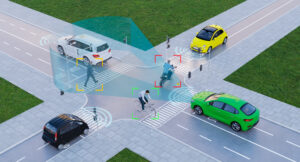
Safety and driver assistance features
Safety features are crucial because they protect you, your passengers, and others on the road. Modern interfaces and dashboards should seamlessly integrate safety features to enhance, rather than distract from the driving experience.
New features in modern cars include blind-spot monitoring, lane departure warnings, and adaptive cruise control. However, the way they present the alerts to you matters a lot. Subtle visual cues like small icons on a dashboard or subtle alerts in the side mirrors are more powerful than loud distracting chimes and flashing lights.
It’s not just about the number of features available, it’s about how they are implemented. Like all user interfaces, safety enhancements on dashboards should be helpful, not intrusive. One example is Volvo’s driver alert system, where the steering wheel gentle vibrates if you drift out of your lane, rather than blasting an alarm. Subtle often has more of an impact than something loud and annoying.
Final thoughts: What makes a great dashboard?
A well-designed car dashboard should be intuitive, easy to use, and visually appealing. Here’s a quick summary of what to look for:
- Logical layout: Controls should be within easy reach and grouped logically.
- Balance of touch and physical controls: Screens are great, but essential functions should still have tactile buttons.
- Good screen placement and visibility: The infotainment screen should be easy to see without distracting from the road.
- Clear instrument cluster: Digital or analog, the main driving data should always be easy to read.
- Smartphone integration: Seamless Apple CarPlay or Android Auto connectivity is a must.
- Build quality: High-quality materials and responsive controls improve the experience.
- Non-intrusive safety features: Alerts should assist rather than annoy.
A dashboard isn’t just a design element—it’s the interface between driver and machine. Get it right, and it enhances every aspect of driving. Get it wrong, and even the best car can feel frustrating to use. When evaluating a vehicle, don’t just look at the specs—pay attention to how the dashboard makes you feel.